<!doctype html>
<html xmlns="http://www.w3.org/1999/xhtml" xmlns:v="urn:schemas-microsoft-com:vml" xmlns:o="urn:schemas-microsoft-com:office:office" lang="en-US" xml:lang="en-US">
  <head>
    <title data-ignore-plain-text>After Gropius: Bauhaus Student Works of the Meyer and Mies Periods</title>
    <meta http-equiv="content-type" content="text/html; charset=utf-8">
    <meta name="viewport" content="width=device-width, initial-scale=1, maximum-scale=1">
    <meta name="format-detection" content="address=no">
    <!--[if (gte mso 9)|(IE)]>
    <style type="text/css" media="screen">
      li {
        text-indent: -1em;
      }
    </style>
    <![endif]-->
    <style type="text/css" media="all">
      body,
.section-text-area,
.section-text-area-wrapper,
.section-text-cell {
    overflow-wrap: break-word;
    word-wrap: break-word;
    -ms-word-break: break-all;
    word-break: break-word;
}
body {
    width: 100% !important;
    min-width: 100% !important;
    -ms-text-size-adjust: none;
    -webkit-text-size-adjust: none;
    mso-line-height-rule: exactly;
}
p {
    margin-block: 0;
}
@media only screen and (max-width:  593px ) {
    table#newsletter-table {
        border: 0 !important;
    }
    table#newsletter-email {
        width: 100% !important;
    }
    img.section-scaleable-image,
    img.section-empty-img {
        max-width: 100% !important;
        height: auto !important;
    }
    .bg-none {
        background: none !important;
    }
    .hauto {
        height: auto !important;
    }
    .show-desktop-only {
        display: none !important;
    }
    .show-mobile-only {
        display: block !important;
        float: none !important;
        line-height: auto !important;
        max-height: inherit !important;
        max-width: inherit !important;
        margin-top: 0px !important;
        overflow: visible !important;
        visibility: inherit !important;
        width: auto !important;
    }
    .stack-cell-wrap {
        display: block !important;
    }
    .stack-cell-up {
        display: table-header-group !important;
    }
    .stack-cell-down {
        display: table-footer-group !important;
    }
    .mw100p {
        max-width: 100% !important;
    }
    .section-horizontal-padding,
    .padding-mobile-both {
        padding-left: 22px !important;
        padding-right: 22px !important;
    }
    .padding-mobile-left {
        padding-left: 22px !important;
    }
    .padding-mobile-right {
        padding-right: 22px !important;
    }
    .text-left {
        text-align: left !important;
    }
    .text-right {
        text-align: right !important;
    }
    .w100p {
        width: 100% !important;
    }
}
.button-style-solid:hover,
.button-style-rounded:hover {
    opacity: .8 !important;
}
a:hover {
    text-decoration: none !important;
}
span.mail-merge-preview {
    border-bottom: 2px dotted currentColor;
    display: inline-block;
    line-height: 1em !important;
    margin-bottom: .125em !important;
}
table#newsletter-section-body .linked-site-title-link {
    color: #160ba3 !important;
}
#header-header-section-left-0 .brand-name .linked-site-title-link {
    color: #000;
    text-decoration: none;
}
#footer-footer-section-stacked-top-0 .brand-name .linked-site-title-link {
    color: #000;
    text-decoration: none;
}
#footer-footer-section-stacked-top-0 .footer-text .linked-site-title-link {
    color: #160ba3;
}
body.renderedPreview #line-line-section-0 div.basic-line[data-line="dashed"] {
    border-width: 1px 0 !important;
}
body.renderedPreview #line-line-section-4 div.basic-line[data-line="dashed"] {
    border-width: .5px 0 !important;
}
body.renderedPreview #line-line-section-6 div.basic-line[data-line="dashed"] {
    border-width: .5px 0 !important;
}
body.renderedPreview #line-line-section-13 div.basic-line[data-line="dashed"] {
    border-width: 1px 0 !important;
}

    </style>
    
    
    <!--[if mso]>
    <noscript>
      <xml>
        <o:OfficeDocumentSettings>
          <o:AllowPNG/>
          <o:PixelsPerInch>96</o:PixelsPerInch>
        </o:OfficeDocumentSettings>
      </xml>
    </noscript>
    <![endif]-->
    
    <!--[if (mso)|(mso 16)]>
      <style type="text/css">
        a {text-decoration: none;}
      </style>
    <![endif]-->
  </head>
  <body style="padding:0;margin:0;text-align:center;background-color:#f4f4f4;">
    <table role="article" aria-label="After Gropius: Bauhaus Student Works of the Meyer and Mies Periods" lang="en-US" cellpadding="0" cellspacing="0" border="0" align="center" id="newsletter-table" style="font-size:16px;font-weight:normal;width:100%;padding:0px;background-color:#f4f4f4;border-top:44px solid #f4f4f4;border-bottom:44px solid #f4f4f4;margin:0 auto;text-align:center;table-layout:fixed;">
  <tbody><tr>
    <td align="center" valign="top" bgcolor="#F4F4F4" id="newsletter-cell" style="font-size:.9375em;">
      <div data-ignore-plain-text class="newsletter-preview-text" style="color:transparent;display:none !important;height:0;max-height:0;max-width:0;opacity:0;overflow:hidden;mso-hide:all;visibility:hidden;width:0;">
        
            $$PLAIN_TEXT_PREVIEW$$
        
      </div>
      <table border="0" cellpadding="0" cellspacing="0" width="594" bgcolor="#FFFFFF" id="newsletter-email">
        <tbody><tr>
          <td align="center" valign="top" id="newsletter-email-wrapper" class="book-sans">
            <table role="presentation" width="100%" cellpadding="0" cellspacing="0" border="0" id="newsletter-section-header">
              <tbody><tr>
                <td align="center" valign="middle" id="newsletter-section-header-cell">
                  
<div id="header-header-section-left-0">


<table role="presentation" width="100%" cellpadding="0" cellspacing="0" border="0" bgcolor="transparent" class="section-content header-section header-section-left" style="background-color:transparent;">
  <tbody><tr>
    <td align="left" valign="middle" class="section-text-area section-content-cell padding-mobile-both" style="padding-top:40px;padding-right:88px;padding-bottom:0px;padding-left:60px;">


    <a class="brand-logo-link" href="https://mcbcollection.com/" style="color:#160ba3 !important;"><img class="brand-logo" src="https://images.squarespace-cdn.com/content/5e68e6f8d34bcf00a52fd5a6/1589307815882-AG0NITLFB7EDTK40V8WJ/Logo+email+header-4-4+flat.jpg?format=750w" height="27" alt="Merrill C. Berman Collection" style="font-size:.7033008252063015em;display:block;border:0;text-decoration:none;line-height:0;font-weight:normal;font-family:'DejaVu Sans Condensed', 'Liberation Sans', 'Nimbus Sans L', 'Helvetica Neue', Helvetica, Arial, sans-serif;color:#000;height:auto;max-height:27px;max-width:100%;width:auto;margin-left:0px;"></a>


    </td>
  </tr>
</tbody></table>

</div>
                </td>
              </tr>
            </tbody></table>
            <table role="presentation" width="100%" cellpadding="0" cellspacing="0" border="0" id="newsletter-section-body">
              <tbody><tr>
                <td align="center" valign="top" width="100%" id="newsletter-section-body-cell">
                  
<div id="line-line-section-0">

<table role="presentation" width="100%" cellpadding="0" cellspacing="0" border="0" bgcolor="transparent" class="line-section section-content">
  <tbody><tr>
    <td align="center" valign="middle" width="100%">
      <table role="presentation" width="100%" cellpadding="0" cellspacing="0" border="0" class="line-section-table section-content" style="width:80%;min-width:80%;">
        <tbody><tr>
          <td align="center" valign="middle" class="section-content-cell" width="100%" style="padding-top:22px;padding-right:0;padding-bottom:22px;padding-left:0;">
            <div class="basic-line" data-line="solid" style="background:none;font-size:0;margin:0;line-height:0;height:0;width:100%;border-style:solid none;border-width:1px 0 1px;border-color:#000;">&nbsp;</div>
          </td>
        </tr>
      </tbody></table>
    </td>
  </tr>
</tbody></table>

</div>
<div id="text-text-section-1">


<table role="presentation" width="100%" cellpadding="0" cellspacing="0" border="0" bgcolor="transparent" class="text-section section-content">
  <tbody><tr>
    <td valign="top" class="section-text-area section-content-cell padding-mobile-both" style="padding-top:11px;padding-right:44px;padding-bottom:22px;padding-left:44px;color:#000;background-color:transparent;">
      <h4 style="color:inherit;margin:1.414em 0 .5em;font-weight:400;line-height:1.25em;font-size:1.2496875em;mso-line-height-alt:1.2496875em;margin-top:0;margin-bottom:0;font-family:'DejaVu Sans Condensed', 'Liberation Sans', 'Nimbus Sans L', 'Helvetica Neue', Helvetica, Arial, sans-serif;letter-spacing:.02em;text-align:center;">After Gropius: Bauhaus Student Works of the <br>Meyer and Mies Periods, 1929–1931</h4>
    </td>
  </tr>
</tbody></table>

</div>
<div id="image-image-section-below-2">
<table role="presentation" width="100%" cellpadding="0" cellspacing="0" border="0" bgcolor="transparent" class="image-section below-layout section-content">


    <tbody><tr>
      <td>
        <table role="presentation" width="100%" cellpadding="0" cellspacing="0" border="0">
          <tbody><tr>
              
    <td class="show-desktop-only section-spacing-left" width="88"></td>
  

            <td align="left" valign="middle" class="section-image-cell section-content-cell section-hoverable-image" data-aspect="ORIGINAL" style="padding:0;">
              
  <img class="section-scaleable-image" src="https://images.squarespace-cdn.com/content/5e68e6f8d34bcf00a52fd5a6/4a4ee0ee-8b9c-4f5a-adfc-9cae3591f731/Untitled+2.jpg?content-type=image%2Fjpeg&amp;format=750w" width="594" alt="" style="font-size:.7033008252063015em;display:block;border:0;text-decoration:none;line-height:0;background-color:transparent;font-weight:normal;height:auto;width:100%;max-width:100%;font-family:'DejaVu Sans Condensed', 'Liberation Sans', 'Nimbus Sans L', 'Helvetica Neue', Helvetica, Arial, sans-serif;">


            </td>
              
    <td class="show-desktop-only section-spacing-right" width="88"></td>
  

          </tr>
        </tbody></table>
      </td>
    </tr>


</tbody></table>

</div>
<div id="text-text-section-3">


<table role="presentation" width="100%" cellpadding="0" cellspacing="0" border="0" bgcolor="transparent" class="text-section section-content">
  <tbody><tr>
    <td valign="top" class="section-text-area section-content-cell padding-mobile-both" style="padding-top:11px;padding-right:44px;padding-bottom:11px;padding-left:44px;color:#313131;background-color:transparent;">
      <p style="color:inherit;font-size:.9375em;line-height:1.618em;margin:0 0 1.25em 0;font-weight:normal;margin-top:0;margin-bottom:0;font-family:'DejaVu Sans Condensed', 'Liberation Sans', 'Nimbus Sans L', 'Helvetica Neue', Helvetica, Arial, sans-serif;text-align:center;" class="">Gerd Balzer (German, 1909–1986; at Bauhaus 1929–1932)<br>Exercise in <em>Darstellende geometrie</em> (represented geometry), <br>likely for Joost Schmidt’s advertising design class, 1929<br>Watercolor and pencil on paper, 24 3/8 x 16 14” (41.8 x 62 cm)<br>Lower right (typed): blatt 2 / darstellende geometrie / I. semester / gerd balzer</p>
    </td>
  </tr>
</tbody></table>

</div>
<div id="line-line-section-4">

<table role="presentation" width="100%" cellpadding="0" cellspacing="0" border="0" bgcolor="transparent" class="line-section section-content">
  <tbody><tr>
    <td align="center" valign="middle" width="100%">
      <table role="presentation" width="100%" cellpadding="0" cellspacing="0" border="0" class="line-section-table section-content" style="width:20%;min-width:20%;">
        <tbody><tr>
          <td align="center" valign="middle" class="section-content-cell" width="100%" style="padding-top:13px;padding-right:0;padding-bottom:24px;padding-left:0;">
            <div class="basic-line" data-line="solid" style="background:none;font-size:0;margin:0;line-height:0;height:0;width:100%;border-style:solid none;border-width:1px 0 0px;border-color:#000;">&nbsp;</div>
          </td>
        </tr>
      </tbody></table>
    </td>
  </tr>
</tbody></table>

</div>
<div id="text-text-section-5">


<table role="presentation" width="100%" cellpadding="0" cellspacing="0" border="0" bgcolor="transparent" class="text-section section-content">
  <tbody><tr>
    <td valign="top" class="section-text-area section-content-cell padding-mobile-both" style="padding-top:8px;padding-right:44px;padding-bottom:0px;padding-left:44px;color:#000;background-color:transparent;">
      <p class="" style="color:inherit;font-size:.9375em;line-height:1.618em;margin:0 0 1.25em 0;font-weight:normal;margin-top:0;font-family:'DejaVu Sans Condensed', 'Liberation Sans', 'Nimbus Sans L', 'Helvetica Neue', Helvetica, Arial, sans-serif;">
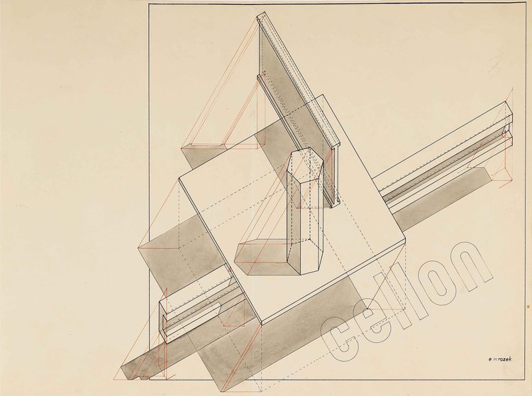
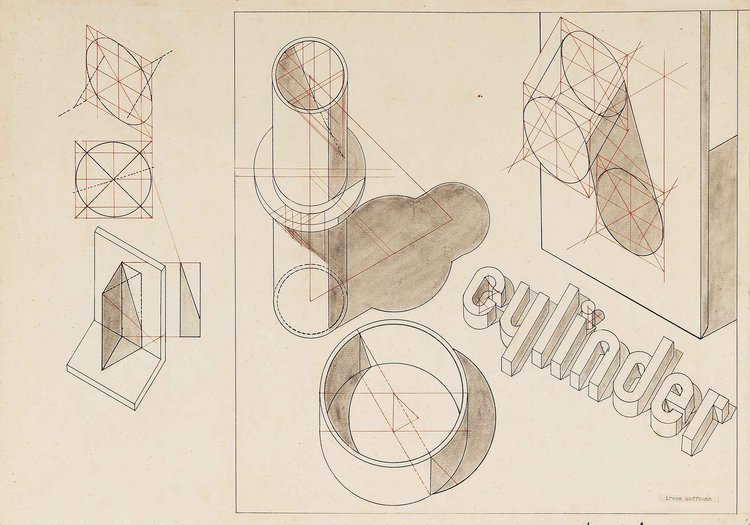
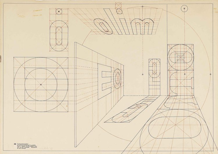
Following Walter Gropius’s resignation as founding director of the Bauhaus on February 4, 1928, the Swiss architect Hannes Meyer was appointed director, beginning on April 1, 1928. Meyer had arrived at the school the previous year to head its newly established department of architecture. Under Meyer’s leadership, the school underwent an important shift in focus towards architecture, attracting a different type of student. The drawings presented here are by three students—Gerd Balzer; Irene (Wallbrecht) Hoffmann; and Erich Mrozek—who attended the Bauhaus during the tenures of Meyer (1928–1930) and his successor Ludwig Mies van der Rohe (1930–1933). Of the three, only Hoffmann made the move from Gropius’s custom-designed Dessau building to the school’s final home in a makeshift, converted telephone-company building in Berlin-Steglitz during the Winter semester 1932.</p><p class="" style="color:inherit;font-size:.9375em;line-height:1.618em;margin:0 0 1.25em 0;font-weight:normal;margin-bottom:0;font-family:'DejaVu Sans Condensed', 'Liberation Sans', 'Nimbus Sans L', 'Helvetica Neue', Helvetica, Arial, sans-serif;">The Getty Research Institute’s rich collection of <a href="https://www.getty.edu/research/collections/collection/113YC7" rel="nofollow" style="color:#160ba3 !important;">Bauhaus Student Work, 1919-1933 (850514)</a> includes related studies by Balzer, Hoffmann, and Mrozek, some of which can be viewed <a href="https://www.getty.edu/research/exhibitions_events/exhibitions/bauhaus/new_artist/img/BNA_Object_Checklist.pdf" rel="nofollow" style="color:#160ba3 !important;">here</a>.&nbsp; </p>
    </td>
  </tr>
</tbody></table>

</div>
<div id="line-line-section-6">

<table role="presentation" width="100%" cellpadding="0" cellspacing="0" border="0" bgcolor="transparent" class="line-section section-content">
  <tbody><tr>
    <td align="center" valign="middle" width="100%">
      <table role="presentation" width="100%" cellpadding="0" cellspacing="0" border="0" class="line-section-table section-content" style="width:20%;min-width:20%;">
        <tbody><tr>
          <td align="center" valign="middle" class="section-content-cell" width="100%" style="padding-top:22px;padding-right:0;padding-bottom:22px;padding-left:0;">
            <div class="basic-line" data-line="solid" style="background:none;font-size:0;margin:0;line-height:0;height:0;width:100%;border-style:solid none;border-width:1px 0 0px;border-color:#000;">&nbsp;</div>
          </td>
        </tr>
      </tbody></table>
    </td>
  </tr>
</tbody></table>

</div>
<div id="image-image-section-below-7">
<table role="presentation" width="100%" cellpadding="0" cellspacing="0" border="0" bgcolor="transparent" class="image-section below-layout section-content">


    <tbody><tr>
      <td>
        <table role="presentation" width="100%" cellpadding="0" cellspacing="0" border="0">
          <tbody><tr>
              
    <td class="show-desktop-only section-spacing-left" width="88"></td>
  

            <td align="left" valign="middle" class="section-image-cell section-content-cell section-hoverable-image" data-aspect="ORIGINAL" style="padding:0;">
              
  <img class="section-scaleable-image" src="https://images.squarespace-cdn.com/content/5e68e6f8d34bcf00a52fd5a6/82ffef1b-f252-4788-b21e-6c28414280ea/JS_5D_10840.jpg?content-type=image%2Fjpeg&amp;format=750w" width="594" alt="" style="font-size:.7033008252063015em;display:block;border:0;text-decoration:none;line-height:0;background-color:transparent;font-weight:normal;height:auto;width:100%;max-width:100%;font-family:'DejaVu Sans Condensed', 'Liberation Sans', 'Nimbus Sans L', 'Helvetica Neue', Helvetica, Arial, sans-serif;">


            </td>
              
    <td class="show-desktop-only section-spacing-right" width="88"></td>
  

          </tr>
        </tbody></table>
      </td>
    </tr>


  <tr>
    <td bgcolor="transparent" class="spacing-below" height="11"></td>
  </tr>


</tbody></table>

</div>
<div id="image-image-section-below-8">
<table role="presentation" width="100%" cellpadding="0" cellspacing="0" border="0" bgcolor="transparent" class="image-section below-layout section-content">

  
  <tbody><tr>
    <td class="spacing-above" height="11"></td>
  </tr>


    <tr>
      <td>
        <table role="presentation" width="100%" cellpadding="0" cellspacing="0" border="0">
          <tbody><tr>
              
    <td class="show-desktop-only section-spacing-left" width="88"></td>
  

            <td align="left" valign="middle" class="section-image-cell section-content-cell section-hoverable-image" data-aspect="ORIGINAL" style="padding:0;">
              
  <img class="section-scaleable-image" src="https://images.squarespace-cdn.com/content/5e68e6f8d34bcf00a52fd5a6/4816d4b7-9c8e-4fd1-9612-8e4bfc1ae386/JS_5D_10841.jpg?content-type=image%2Fjpeg&amp;format=750w" width="594" alt="" style="font-size:.7033008252063015em;display:block;border:0;text-decoration:none;line-height:0;background-color:transparent;font-weight:normal;height:auto;width:100%;max-width:100%;font-family:'DejaVu Sans Condensed', 'Liberation Sans', 'Nimbus Sans L', 'Helvetica Neue', Helvetica, Arial, sans-serif;">


            </td>
              
    <td class="show-desktop-only section-spacing-right" width="88"></td>
  

          </tr>
        </tbody></table>
      </td>
    </tr>


</tbody></table>

</div>
<div id="text-text-section-9">


<table role="presentation" width="100%" cellpadding="0" cellspacing="0" border="0" bgcolor="transparent" class="text-section section-content">
  <tbody><tr>
    <td valign="top" class="section-text-area section-content-cell padding-mobile-both" style="padding-top:13px;padding-right:44px;padding-bottom:22px;padding-left:44px;color:#000;background-color:transparent;">
      <p style="color:inherit;font-size:.9375em;line-height:1.618em;margin:0 0 1.25em 0;font-weight:normal;margin-top:0;margin-bottom:0;font-family:'DejaVu Sans Condensed', 'Liberation Sans', 'Nimbus Sans L', 'Helvetica Neue', Helvetica, Arial, sans-serif;text-align:center;" class="">Erich Mrozek (German, 1910–1993; at Bauhaus 1929–1931)<br>Two exercises, likely for Joost Schmidt’s advertising design class, 1929<br>Above: Ink and pencil on paper, 16 1/2 x 20 1/2” (41.9 x 52.1 cm)<br>Below: Ink on paper, 16 7/16 x 22 3/16” (41.6 x 56.4 cm) <br>Both, lower right: e. mrozek</p>
    </td>
  </tr>
</tbody></table>

</div>
<div id="image-image-section-below-10">
<table role="presentation" width="100%" cellpadding="0" cellspacing="0" border="0" bgcolor="transparent" class="image-section below-layout section-content">


    <tbody><tr>
      <td>
        <table role="presentation" width="100%" cellpadding="0" cellspacing="0" border="0">
          <tbody><tr>
              
    <td class="show-desktop-only section-spacing-left" width="88"></td>
  

            <td align="left" valign="middle" class="section-image-cell section-content-cell section-hoverable-image" data-aspect="ORIGINAL" style="padding:0;">
              
  <img class="section-scaleable-image" src="https://images.squarespace-cdn.com/content/5e68e6f8d34bcf00a52fd5a6/2dce30aa-7e5c-49f1-b206-0787a3a0dd05/JS_5D_10842.jpg?content-type=image%2Fjpeg&amp;format=750w" width="594" alt="" style="font-size:.7033008252063015em;display:block;border:0;text-decoration:none;line-height:0;background-color:transparent;font-weight:normal;height:auto;width:100%;max-width:100%;font-family:'DejaVu Sans Condensed', 'Liberation Sans', 'Nimbus Sans L', 'Helvetica Neue', Helvetica, Arial, sans-serif;">


            </td>
              
    <td class="show-desktop-only section-spacing-right" width="88"></td>
  

          </tr>
        </tbody></table>
      </td>
    </tr>


  <tr>
    <td bgcolor="transparent" class="spacing-below" height="11"></td>
  </tr>


</tbody></table>

</div>
<div id="image-image-section-below-11">
<table role="presentation" width="100%" cellpadding="0" cellspacing="0" border="0" bgcolor="transparent" class="image-section below-layout section-content">

  
  <tbody><tr>
    <td class="spacing-above" height="11"></td>
  </tr>


    <tr>
      <td>
        <table role="presentation" width="100%" cellpadding="0" cellspacing="0" border="0">
          <tbody><tr>
              
    <td class="show-desktop-only section-spacing-left" width="88"></td>
  

            <td align="left" valign="middle" class="section-image-cell section-content-cell section-hoverable-image" data-aspect="ORIGINAL" style="padding:0;">
              
  <img class="section-scaleable-image" src="https://images.squarespace-cdn.com/content/5e68e6f8d34bcf00a52fd5a6/fbfdd1bd-e004-4b26-b239-48c4fab7df67/JS_5D_10843.jpg?content-type=image%2Fjpeg&amp;format=750w" width="594" alt="" style="font-size:.7033008252063015em;display:block;border:0;text-decoration:none;line-height:0;background-color:transparent;font-weight:normal;height:auto;width:100%;max-width:100%;font-family:'DejaVu Sans Condensed', 'Liberation Sans', 'Nimbus Sans L', 'Helvetica Neue', Helvetica, Arial, sans-serif;">


            </td>
              
    <td class="show-desktop-only section-spacing-right" width="88"></td>
  

          </tr>
        </tbody></table>
      </td>
    </tr>


</tbody></table>

</div>
<div id="text-text-section-12">


<table role="presentation" width="100%" cellpadding="0" cellspacing="0" border="0" bgcolor="transparent" class="text-section section-content">
  <tbody><tr>
    <td valign="top" class="section-text-area section-content-cell padding-mobile-both" style="padding-top:13px;padding-right:44px;padding-bottom:22px;padding-left:44px;color:#000;background-color:transparent;">
      <p style="color:inherit;font-size:.9375em;line-height:1.618em;margin:0 0 1.25em 0;font-weight:normal;margin-top:0;margin-bottom:0;font-family:'DejaVu Sans Condensed', 'Liberation Sans', 'Nimbus Sans L', 'Helvetica Neue', Helvetica, Arial, sans-serif;text-align:center;" class="">Irene Hoffmann (born Wallbrecht) (German, 1903–1971; Bauhaus 1929–1933)<br>Two exercises, likely for Joost Schmidt’s advertising class, c. 1930–1931<br>Both: Ink and pencil on paper, 16 7/16 x 23 3/8” (41.8 x 59.4 cm)<br>Above: lower right (typed): irene hoffmann<br>Below: lower left (printed): 46. Fluchtpunktperspektive / perspective darstellung für parallele linien u. flächen, die in bildtafel unter 45 [Grad] und 90 [Grad] schneiden. Distanzkreis für alle 45 [Grad] linien (vanishing point perspective / perspective representation of parallel lines and surfaces that intersect in the image at 45 and 90 degrees; distance circle for all lines is 45 degrees)</p>
    </td>
  </tr>
</tbody></table>

</div>
<div id="line-line-section-13">

<table role="presentation" width="100%" cellpadding="0" cellspacing="0" border="0" bgcolor="transparent" class="line-section section-content">
  <tbody><tr>
    <td align="center" valign="middle" width="100%">
      <table role="presentation" width="100%" cellpadding="0" cellspacing="0" border="0" class="line-section-table section-content" style="width:80%;min-width:80%;">
        <tbody><tr>
          <td align="center" valign="middle" class="section-content-cell" width="100%" style="padding-top:22px;padding-right:0;padding-bottom:22px;padding-left:0;">
            <div class="basic-line" data-line="solid" style="background:none;font-size:0;margin:0;line-height:0;height:0;width:100%;border-style:solid none;border-width:1px 0 1px;border-color:#000;">&nbsp;</div>
          </td>
        </tr>
      </tbody></table>
    </td>
  </tr>
</tbody></table>

</div>
<div id="text-text-section-14">


<table role="presentation" width="100%" cellpadding="0" cellspacing="0" border="0" bgcolor="transparent" class="text-section section-content">
  <tbody><tr>
    <td valign="top" class="section-text-area section-content-cell padding-mobile-both" style="padding-top:11px;padding-right:44px;padding-bottom:11px;padding-left:44px;color:#000;background-color:transparent;">
      <p style="color:inherit;font-size:.9375em;line-height:1.618em;margin:0 0 1.25em 0;font-weight:normal;margin-top:0;margin-bottom:0;font-family:'DejaVu Sans Condensed', 'Liberation Sans', 'Nimbus Sans L', 'Helvetica Neue', Helvetica, Arial, sans-serif;text-align:center;" class="">August 8, 2023</p>
    </td>
  </tr>
</tbody></table>

</div>
                </td>
              </tr>
            </tbody></table>
            
              <table role="presentation" width="100%" cellpadding="0" cellspacing="0" border="0" id="newsletter-section-footer">
                <tbody><tr>
                  <td align="center" valign="top" id="newsletter-section-footer-cell">
                    
<div id="footer-footer-section-stacked-top-0">


<table role="presentation" width="100%" cellpadding="0" cellspacing="0" border="0" bgcolor="transparent" class="footer-section footer-section-stacked section-content" style="background-color:transparent;">
  <tbody><tr>
    <td align="center" valign="top" class="section-text-area section-content-cell padding-mobile-both" style="padding-top:44px;padding-right:70px;padding-bottom:66px;padding-left:70px;">
      
  <p class="brand-name" style="line-height:1.618em;font-weight:normal;margin-top:0;font-family:'DejaVu Sans Condensed', 'Liberation Sans', 'Nimbus Sans L', 'Helvetica Neue', Helvetica, Arial, sans-serif;color:#000;margin-bottom:13.75px;font-size:15px;mso-line-height-alt:15px;white-space:pre-wrap;margin:0 0 13.75px 0;padding:0;">Merrill C. Berman Collection</p>


  <table role="presentation" class="social-links" cellpadding="0" cellspacing="0" border="0">
    <tbody><tr>
    
    
      <td valign="top" width="30" height="52">
        <a href="https://www.instagram.com/merrillcbermancollection/" style="color:#160ba3 !important;text-decoration:none;">
          <img class="social-link-icon" src="https://assets.squarespace.com/composer/assets/images/email/social-icons/instagram+dark.png" width="22" height="22" max-width="22" alt="instagram" style="font-size:.7033008252063015em;text-decoration:none;line-height:0;font-weight:normal;font-family:'DejaVu Sans Condensed', 'Liberation Sans', 'Nimbus Sans L', 'Helvetica Neue', Helvetica, Arial, sans-serif;display:block;margin:0 auto;border:0;">
        </a>
      </td>


<td class="" width="20"></td>

    
      <td valign="top" width="30" height="52">
        <a href="mailto:mcbcollect@mindspring.com" style="color:#160ba3 !important;text-decoration:none;">
          <img class="social-link-icon" src="https://assets.squarespace.com/composer/assets/images/email/social-icons/email+dark.png" width="22" height="22" max-width="22" alt="email" style="font-size:.7033008252063015em;text-decoration:none;line-height:0;font-weight:normal;font-family:'DejaVu Sans Condensed', 'Liberation Sans', 'Nimbus Sans L', 'Helvetica Neue', Helvetica, Arial, sans-serif;display:block;margin:0 auto;border:0;">
        </a>
      </td>
    
    </tr>
  </tbody></table>


    <p class="footer-company-info" style="line-height:1.618em;font-weight:normal;font-family:'DejaVu Sans Condensed', 'Liberation Sans', 'Nimbus Sans L', 'Helvetica Neue', Helvetica, Arial, sans-serif;color:#111;font-size:11px;margin:0 0 13.75px 0;padding:0;">
  <a style="color:#111;text-decoration:none;font-size:inherit;font-family:inherit;font-weight:inherit;line-height:inherit;cursor:default;">
  555 Theodore Fremd Avenue, Suite C203, 
  Rye NY 10580, 
  US</a>
</p>


      <p class="footer-links" style="line-height:1.618em;font-weight:normal;margin-bottom:0;font-family:'DejaVu Sans Condensed', 'Liberation Sans', 'Nimbus Sans L', 'Helvetica Neue', Helvetica, Arial, sans-serif;color:#111;font-size:11px;margin:0 0 13.75px 0;padding:0;">
  <a href="#" class="unsubscribe-link" style="text-decoration:underline;color:#313131;">
    <span class="unsubscribe-link-text" style="font-size:inherit;font-weight:inherit;line-height:inherit;margin:0;">Unsubscribe</span>
  </a>
</p>

    </td>
  </tr>
</tbody></table>

</div>
                  </td>
                </tr>
              </tbody></table>
            
          </td>
        </tr>
      </tbody></table>
    </td>
  </tr>
</tbody></table>

  
</body></html>
