<!doctype html>
<html xmlns="http://www.w3.org/1999/xhtml" xmlns:v="urn:schemas-microsoft-com:vml" xmlns:o="urn:schemas-microsoft-com:office:office" lang="en-US" xml:lang="en-US">
  <head>
    <title data-ignore-plain-text>Max Radler (German, 1904&ndash;1971)</title>
    <meta http-equiv="content-type" content="text/html; charset=utf-8">
    <meta name="viewport" content="width=device-width, initial-scale=1, maximum-scale=1">
    <meta name="format-detection" content="address=no">
    <!--[if (gte mso 9)|(IE)]>
    <style type="text/css" media="screen">
      li {
        text-indent: -1em;
      }
    </style>
    <![endif]-->
    <style type="text/css" media="all">
      body,
.section-text-area,
.section-text-area-wrapper,
.section-text-cell {
    overflow-wrap: break-word;
    word-wrap: break-word;
    -ms-word-break: break-all;
    word-break: break-word;
}
body {
    width: 100% !important;
    min-width: 100% !important;
    -ms-text-size-adjust: none;
    -webkit-text-size-adjust: none;
    mso-line-height-rule: exactly;
}
p {
    margin-block: 0;
}
@media only screen and (max-width:  593px ) {
    table#newsletter-table {
        border: 0 !important;
    }
    table#newsletter-email {
        width: 100% !important;
    }
    img.section-scaleable-image,
    img.section-empty-img {
        max-width: 100% !important;
        height: auto !important;
    }
    .bg-none {
        background: none !important;
    }
    .hauto {
        height: auto !important;
    }
    .show-desktop-only {
        display: none !important;
    }
    .show-mobile-only {
        display: block !important;
        float: none !important;
        line-height: auto !important;
        max-height: inherit !important;
        max-width: inherit !important;
        margin-top: 0px !important;
        overflow: visible !important;
        visibility: inherit !important;
        width: auto !important;
    }
    .stack-cell-wrap {
        display: block !important;
    }
    .stack-cell-up {
        display: table-header-group !important;
    }
    .stack-cell-down {
        display: table-footer-group !important;
    }
    .mw100p {
        max-width: 100% !important;
    }
    .section-horizontal-padding,
    .padding-mobile-both {
        padding-left: 22px !important;
        padding-right: 22px !important;
    }
    .padding-mobile-left {
        padding-left: 22px !important;
    }
    .padding-mobile-right {
        padding-right: 22px !important;
    }
    .text-left {
        text-align: left !important;
    }
    .text-right {
        text-align: right !important;
    }
    .w100p {
        width: 100% !important;
    }
}
.button-style-solid:hover,
.button-style-rounded:hover {
    opacity: .8 !important;
}
a:hover {
    text-decoration: none !important;
}
span.mail-merge-preview {
    border-bottom: 2px dotted currentColor;
    display: inline-block;
    line-height: 1em !important;
    margin-bottom: .125em !important;
}
table#newsletter-section-body .linked-site-title-link {
    color: #160ba3 !important;
}
#header-header-section-left-0 .brand-name .linked-site-title-link {
    color: #000;
    text-decoration: none;
}
#footer-footer-section-stacked-top-0 .brand-name .linked-site-title-link {
    color: #000;
    text-decoration: none;
}
#footer-footer-section-stacked-top-0 .footer-text .linked-site-title-link {
    color: #160ba3;
}
body.renderedPreview #line-line-section-0 div.basic-line[data-line="dashed"] {
    border-width: 1px 0 !important;
}
body.renderedPreview #line-line-section-4 div.basic-line[data-line="dashed"] {
    border-width: .5px 0 !important;
}
body.renderedPreview #line-line-section-6 div.basic-line[data-line="dashed"] {
    border-width: .5px 0 !important;
}
body.renderedPreview #line-line-section-9 div.basic-line[data-line="dashed"] {
    border-width: 1px 0 !important;
}

    </style>
    
    
    <!--[if mso]>
    <noscript>
      <xml>
        <o:OfficeDocumentSettings>
          <o:AllowPNG/>
          <o:PixelsPerInch>96</o:PixelsPerInch>
        </o:OfficeDocumentSettings>
      </xml>
    </noscript>
    <![endif]-->
    
    <!--[if (mso)|(mso 16)]>
      <style type="text/css">
        a {text-decoration: none;}
      </style>
    <![endif]-->
  </head>
  <body style="padding:0;margin:0;text-align:center;background-color:#f4f4f4;">
    <table role="article" aria-label="Max Radler (German, 1904&ndash;1971)" lang="en-US" cellpadding="0" cellspacing="0" border="0" align="center" id="newsletter-table" style="font-size:16px;font-weight:normal;width:100%;padding:0px;background-color:#f4f4f4;border-top:44px solid #f4f4f4;border-bottom:44px solid #f4f4f4;margin:0 auto;text-align:center;table-layout:fixed;">
  <tbody><tr>
    <td align="center" valign="top" bgcolor="#F4F4F4" id="newsletter-cell" style="font-size:.9375em;">
      <div data-ignore-plain-text class="newsletter-preview-text" style="color:transparent;display:none !important;height:0;max-height:0;max-width:0;opacity:0;overflow:hidden;mso-hide:all;visibility:hidden;width:0;">
        
            $$PLAIN_TEXT_PREVIEW$$
        
      </div>
      <table border="0" cellpadding="0" cellspacing="0" width="594" bgcolor="#FFFFFF" id="newsletter-email">
        <tbody><tr>
          <td align="center" valign="top" id="newsletter-email-wrapper" class="book-sans">
            <table role="presentation" width="100%" cellpadding="0" cellspacing="0" border="0" id="newsletter-section-header">
              <tbody><tr>
                <td align="center" valign="middle" id="newsletter-section-header-cell">
                  
<div id="header-header-section-left-0">


<table role="presentation" width="100%" cellpadding="0" cellspacing="0" border="0" bgcolor="transparent" class="section-content header-section header-section-left" style="background-color:transparent;">
  <tbody><tr>
    <td align="left" valign="middle" class="section-text-area section-content-cell padding-mobile-both" style="padding-top:40px;padding-right:88px;padding-bottom:0px;padding-left:60px;">


    <a class="brand-logo-link" href="https://mcbcollection.com/" style="color:#160ba3 !important;"><img class="brand-logo" src="https://images.squarespace-cdn.com/content/5e68e6f8d34bcf00a52fd5a6/1589307815882-AG0NITLFB7EDTK40V8WJ/Logo+email+header-4-4+flat.jpg?format=750w" height="27" alt="Merrill C. Berman Collection" style="font-size:.7033008252063015em;display:block;border:0;text-decoration:none;line-height:0;font-weight:normal;font-family:'DejaVu Sans Condensed', 'Liberation Sans', 'Nimbus Sans L', 'Helvetica Neue', Helvetica, Arial, sans-serif;color:#000;height:auto;max-height:27px;max-width:100%;width:auto;margin-left:0px;"></a>


    </td>
  </tr>
</tbody></table>

</div>
                </td>
              </tr>
            </tbody></table>
            <table role="presentation" width="100%" cellpadding="0" cellspacing="0" border="0" id="newsletter-section-body">
              <tbody><tr>
                <td align="center" valign="top" width="100%" id="newsletter-section-body-cell">
                  
<div id="line-line-section-0">

<table role="presentation" width="100%" cellpadding="0" cellspacing="0" border="0" bgcolor="transparent" class="line-section section-content">
  <tbody><tr>
    <td align="center" valign="middle" width="100%">
      <table role="presentation" width="100%" cellpadding="0" cellspacing="0" border="0" class="line-section-table section-content" style="width:80%;min-width:80%;">
        <tbody><tr>
          <td align="center" valign="middle" class="section-content-cell" width="100%" style="padding-top:22px;padding-right:0;padding-bottom:22px;padding-left:0;">
            <div class="basic-line" data-line="solid" style="background:none;font-size:0;margin:0;line-height:0;height:0;width:100%;border-style:solid none;border-width:1px 0 1px;border-color:#000;">&nbsp;</div>
          </td>
        </tr>
      </tbody></table>
    </td>
  </tr>
</tbody></table>

</div>
<div id="text-text-section-1">


<table role="presentation" width="100%" cellpadding="0" cellspacing="0" border="0" bgcolor="transparent" class="text-section section-content">
  <tbody><tr>
    <td valign="top" class="section-text-area section-content-cell padding-mobile-both" style="padding-top:11px;padding-right:44px;padding-bottom:22px;padding-left:44px;color:#000;background-color:transparent;">
      <h4 style="color:inherit;margin:1.414em 0 .5em;font-weight:400;line-height:1.25em;font-size:1.2496875em;mso-line-height-alt:1.2496875em;margin-top:0;margin-bottom:0;font-family:'DejaVu Sans Condensed', 'Liberation Sans', 'Nimbus Sans L', 'Helvetica Neue', Helvetica, Arial, sans-serif;letter-spacing:.02em;text-align:center;">Max Radler (German, 1904–1971)</h4>
    </td>
  </tr>
</tbody></table>

</div>
<div id="image-image-section-below-2">
<table role="presentation" width="100%" cellpadding="0" cellspacing="0" border="0" bgcolor="transparent" class="image-section below-layout section-content">


    <tbody><tr>
      <td>
        <table role="presentation" width="100%" cellpadding="0" cellspacing="0" border="0">
          <tbody><tr>
              

            <td align="left" valign="middle" class="section-image-cell section-content-cell section-hoverable-image" data-aspect="ORIGINAL" style="padding:0;">
              
  <img class="section-scaleable-image" src="https://images.squarespace-cdn.com/content/5e68e6f8d34bcf00a52fd5a6/323eac6d-ee04-45a8-a4cc-30efc1f94fb9/Radler-crop.jpg?content-type=image%2Fjpeg&amp;format=750w" width="594" alt="" style="font-size:.7033008252063015em;display:block;border:0;text-decoration:none;line-height:0;background-color:transparent;font-weight:normal;height:auto;width:100%;max-width:100%;font-family:'DejaVu Sans Condensed', 'Liberation Sans', 'Nimbus Sans L', 'Helvetica Neue', Helvetica, Arial, sans-serif;">


            </td>
              

          </tr>
        </tbody></table>
      </td>
    </tr>


</tbody></table>

</div>
<div id="text-text-section-3">


<table role="presentation" width="100%" cellpadding="0" cellspacing="0" border="0" bgcolor="transparent" class="text-section section-content">
  <tbody><tr>
    <td valign="top" class="section-text-area section-content-cell padding-mobile-both" style="padding-top:11px;padding-right:44px;padding-bottom:11px;padding-left:44px;color:#313131;background-color:transparent;">
      <p style="color:inherit;font-size:.9375em;line-height:1.618em;margin:0 0 1.25em 0;font-weight:normal;margin-top:0;margin-bottom:0;font-family:'DejaVu Sans Condensed', 'Liberation Sans', 'Nimbus Sans L', 'Helvetica Neue', Helvetica, Arial, sans-serif;text-align:center;" class="">Max Radler (German, 1904–1971)<br><em>Lange Brücke</em> (Long Bridge), 1934<br>Oil on canvas, 28 6/8 x 41 1/2” (65 x 105 cm)</p>
    </td>
  </tr>
</tbody></table>

</div>
<div id="line-line-section-4">

<table role="presentation" width="100%" cellpadding="0" cellspacing="0" border="0" bgcolor="transparent" class="line-section section-content">
  <tbody><tr>
    <td align="center" valign="middle" width="100%">
      <table role="presentation" width="100%" cellpadding="0" cellspacing="0" border="0" class="line-section-table section-content" style="width:20%;min-width:20%;">
        <tbody><tr>
          <td align="center" valign="middle" class="section-content-cell" width="100%" style="padding-top:13px;padding-right:0;padding-bottom:24px;padding-left:0;">
            <div class="basic-line" data-line="solid" style="background:none;font-size:0;margin:0;line-height:0;height:0;width:100%;border-style:solid none;border-width:1px 0 0px;border-color:#000;">&nbsp;</div>
          </td>
        </tr>
      </tbody></table>
    </td>
  </tr>
</tbody></table>

</div>
<div id="text-text-section-5">


<table role="presentation" width="100%" cellpadding="0" cellspacing="0" border="0" bgcolor="transparent" class="text-section section-content">
  <tbody><tr>
    <td valign="top" class="section-text-area section-content-cell padding-mobile-both" style="padding-top:8px;padding-right:44px;padding-bottom:0px;padding-left:44px;color:#000;background-color:transparent;">
      <p class="" style="color:inherit;font-size:.9375em;line-height:1.618em;margin:0 0 1.25em 0;font-weight:normal;margin-top:0;font-family:'DejaVu Sans Condensed', 'Liberation Sans', 'Nimbus Sans L', 'Helvetica Neue', Helvetica, Arial, sans-serif;">
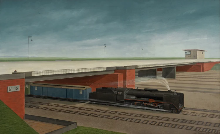
Today we focus on a single work in the collection: a large-scale oil painting by the Munich-based painter Max Radler (German, 1904–1971). One is struck by the clear formal order of the composition. It is divided at the horizon line into upper and lower zones, and sliced through at center by the diagonal wedge of the bridge’s receding surface. The upper zone is mostly sky, its infinity measured by intermittent street lamps. It is still and barren. Two tiny figures—one at the railing, the other in the building—flank its expanse. The lower zone, beneath the bridge, is where the action takes place: a speeding train hurtles to its destination. A whoosh of smoke is described by the only free-hand brushstroke in the otherwise tightly-painted composition (see detail below). It is an arabesque of thin, dry, white paint; a transparent, atmospheric anomaly within the dense, solid, angular surroundings. Stillness and silence dominate the upper zone, whereas a short-lived roar blasts from below. As in the best of so-called <em>Neue Sachlichkeit</em> (New Objectivity) painting, this work describes palpable tension between the wonder of mechanization and its bleak, alienating effects.</p><p class="" style="color:inherit;font-size:.9375em;line-height:1.618em;margin:0 0 1.25em 0;font-weight:normal;margin-bottom:0;font-family:'DejaVu Sans Condensed', 'Liberation Sans', 'Nimbus Sans L', 'Helvetica Neue', Helvetica, Arial, sans-serif;">Radler is perhaps best-known today for his <em><a href="https://www.lenbachhaus.de/en/discover/collection-online/detail?tx_so_displayso%5Baction%5D=show&amp;tx_so_displayso%5Bobjekt%5D=477&amp;tx_so_displayso%5Borigin%5D=9&amp;tx_so_displayso%5BoriginUid%5D=8521&amp;cHash=5618bad3c778f518ba25b0d95caa1436" rel="nofollow" style="color:#160ba3 !important;">Der Radiohörer</a></em> (The Radio Listener) of 1930 in Munich’s Lenbachhaus. Very few of his paintings of the 1930s survived the bombings of Munich during the Second World War.</p>
    </td>
  </tr>
</tbody></table>

</div>
<div id="line-line-section-6">

<table role="presentation" width="100%" cellpadding="0" cellspacing="0" border="0" bgcolor="transparent" class="line-section section-content">
  <tbody><tr>
    <td align="center" valign="middle" width="100%">
      <table role="presentation" width="100%" cellpadding="0" cellspacing="0" border="0" class="line-section-table section-content" style="width:20%;min-width:20%;">
        <tbody><tr>
          <td align="center" valign="middle" class="section-content-cell" width="100%" style="padding-top:22px;padding-right:0;padding-bottom:22px;padding-left:0;">
            <div class="basic-line" data-line="solid" style="background:none;font-size:0;margin:0;line-height:0;height:0;width:100%;border-style:solid none;border-width:1px 0 0px;border-color:#000;">&nbsp;</div>
          </td>
        </tr>
      </tbody></table>
    </td>
  </tr>
</tbody></table>

</div>
<div id="image-image-section-below-7">
<table role="presentation" width="100%" cellpadding="0" cellspacing="0" border="0" bgcolor="transparent" class="image-section below-layout section-content">

  
  <tbody><tr>
    <td class="spacing-above" height="11"></td>
  </tr>


    <tr>
      <td>
        <table role="presentation" width="100%" cellpadding="0" cellspacing="0" border="0">
          <tbody><tr>
              
    <td class="show-desktop-only section-spacing-left" width="88"></td>
  

            <td align="left" valign="middle" class="section-image-cell section-content-cell section-hoverable-image" data-aspect="ORIGINAL" style="padding:0;">
              
  <img class="section-scaleable-image" src="https://images.squarespace-cdn.com/content/5e68e6f8d34bcf00a52fd5a6/4414cf9f-175e-400c-ae5c-12d90f392b3c/Radler-crop+copy.jpg?content-type=image%2Fjpeg&amp;format=750w" width="594" alt="" style="font-size:.7033008252063015em;display:block;border:0;text-decoration:none;line-height:0;background-color:transparent;font-weight:normal;height:auto;width:100%;max-width:100%;font-family:'DejaVu Sans Condensed', 'Liberation Sans', 'Nimbus Sans L', 'Helvetica Neue', Helvetica, Arial, sans-serif;">


            </td>
              
    <td class="show-desktop-only section-spacing-right" width="88"></td>
  

          </tr>
        </tbody></table>
      </td>
    </tr>


</tbody></table>

</div>
<div id="text-text-section-8">


<table role="presentation" width="100%" cellpadding="0" cellspacing="0" border="0" bgcolor="transparent" class="text-section section-content">
  <tbody><tr>
    <td valign="top" class="section-text-area section-content-cell padding-mobile-both" style="padding-top:13px;padding-right:44px;padding-bottom:22px;padding-left:44px;color:#000;background-color:transparent;">
      <p style="color:inherit;font-size:.9375em;line-height:1.618em;margin:0 0 1.25em 0;font-weight:normal;margin-top:0;margin-bottom:0;font-family:'DejaVu Sans Condensed', 'Liberation Sans', 'Nimbus Sans L', 'Helvetica Neue', Helvetica, Arial, sans-serif;text-align:center;" class="">Detail of the above.</p>
    </td>
  </tr>
</tbody></table>

</div>
<div id="line-line-section-9">

<table role="presentation" width="100%" cellpadding="0" cellspacing="0" border="0" bgcolor="transparent" class="line-section section-content">
  <tbody><tr>
    <td align="center" valign="middle" width="100%">
      <table role="presentation" width="100%" cellpadding="0" cellspacing="0" border="0" class="line-section-table section-content" style="width:80%;min-width:80%;">
        <tbody><tr>
          <td align="center" valign="middle" class="section-content-cell" width="100%" style="padding-top:22px;padding-right:0;padding-bottom:22px;padding-left:0;">
            <div class="basic-line" data-line="solid" style="background:none;font-size:0;margin:0;line-height:0;height:0;width:100%;border-style:solid none;border-width:1px 0 1px;border-color:#000;">&nbsp;</div>
          </td>
        </tr>
      </tbody></table>
    </td>
  </tr>
</tbody></table>

</div>
<div id="text-text-section-10">


<table role="presentation" width="100%" cellpadding="0" cellspacing="0" border="0" bgcolor="transparent" class="text-section section-content">
  <tbody><tr>
    <td valign="top" class="section-text-area section-content-cell padding-mobile-both" style="padding-top:11px;padding-right:44px;padding-bottom:11px;padding-left:44px;color:#000;background-color:transparent;">
      <p style="color:inherit;font-size:.9375em;line-height:1.618em;margin:0 0 1.25em 0;font-weight:normal;margin-top:0;margin-bottom:0;font-family:'DejaVu Sans Condensed', 'Liberation Sans', 'Nimbus Sans L', 'Helvetica Neue', Helvetica, Arial, sans-serif;text-align:center;" class="">October 11, 2023</p>
    </td>
  </tr>
</tbody></table>

</div>
                </td>
              </tr>
            </tbody></table>
            
              <table role="presentation" width="100%" cellpadding="0" cellspacing="0" border="0" id="newsletter-section-footer">
                <tbody><tr>
                  <td align="center" valign="top" id="newsletter-section-footer-cell">
                    
<div id="footer-footer-section-stacked-top-0">


<table role="presentation" width="100%" cellpadding="0" cellspacing="0" border="0" bgcolor="transparent" class="footer-section footer-section-stacked section-content" style="background-color:transparent;">
  <tbody><tr>
    <td align="center" valign="top" class="section-text-area section-content-cell padding-mobile-both" style="padding-top:44px;padding-right:70px;padding-bottom:66px;padding-left:70px;">
      
  <p class="brand-name" style="line-height:1.618em;font-weight:normal;margin-top:0;font-family:'DejaVu Sans Condensed', 'Liberation Sans', 'Nimbus Sans L', 'Helvetica Neue', Helvetica, Arial, sans-serif;color:#000;margin-bottom:13.75px;font-size:15px;mso-line-height-alt:15px;white-space:pre-wrap;margin:0 0 13.75px 0;padding:0;">Merrill C. Berman Collection</p>


  <table role="presentation" class="social-links" cellpadding="0" cellspacing="0" border="0">
    <tbody><tr>
    
    
      <td valign="top" width="30" height="52">
        <a href="https://www.instagram.com/merrillcbermancollection/" style="color:#160ba3 !important;text-decoration:none;">
          <img class="social-link-icon" src="https://assets.squarespace.com/composer/assets/images/email/social-icons/instagram+dark.png" width="22" height="22" max-width="22" alt="instagram" style="font-size:.7033008252063015em;text-decoration:none;line-height:0;font-weight:normal;font-family:'DejaVu Sans Condensed', 'Liberation Sans', 'Nimbus Sans L', 'Helvetica Neue', Helvetica, Arial, sans-serif;display:block;margin:0 auto;border:0;">
        </a>
      </td>


<td class="" width="20"></td>

    
      <td valign="top" width="30" height="52">
        <a href="mailto:mcbcollect@mindspring.com" style="color:#160ba3 !important;text-decoration:none;">
          <img class="social-link-icon" src="https://assets.squarespace.com/composer/assets/images/email/social-icons/email+dark.png" width="22" height="22" max-width="22" alt="email" style="font-size:.7033008252063015em;text-decoration:none;line-height:0;font-weight:normal;font-family:'DejaVu Sans Condensed', 'Liberation Sans', 'Nimbus Sans L', 'Helvetica Neue', Helvetica, Arial, sans-serif;display:block;margin:0 auto;border:0;">
        </a>
      </td>
    
    </tr>
  </tbody></table>


    <p class="footer-company-info" style="line-height:1.618em;font-weight:normal;font-family:'DejaVu Sans Condensed', 'Liberation Sans', 'Nimbus Sans L', 'Helvetica Neue', Helvetica, Arial, sans-serif;color:#111;font-size:11px;margin:0 0 13.75px 0;padding:0;">
  <a style="color:#111;text-decoration:none;font-size:inherit;font-family:inherit;font-weight:inherit;line-height:inherit;cursor:default;">
  555 Theodore Fremd Avenue, Suite C203, 
  Rye NY 10580, 
  US</a>
</p>


      <p class="footer-links" style="line-height:1.618em;font-weight:normal;margin-bottom:0;font-family:'DejaVu Sans Condensed', 'Liberation Sans', 'Nimbus Sans L', 'Helvetica Neue', Helvetica, Arial, sans-serif;font-size:11px;color:#313131;margin:0 0 13.75px 0;padding:0;">
  <a href="#" class="unsubscribe-link" style="color:#313131;text-decoration:underline;">
    <span class="unsubscribe-link-text" style="font-size:inherit;font-weight:inherit;line-height:inherit;margin:0;">Unsubscribe</span>
  </a>
</p>

    </td>
  </tr>
</tbody></table>

</div>
                  </td>
                </tr>
              </tbody></table>
            
          </td>
        </tr>
      </tbody></table>
    </td>
  </tr>
</tbody></table>

  
</body></html>
